Draft 1
The first challenge I faced is that the colour cannot be completely copied due to the limited colour palette. However, the layering process and the overlapping colours create intentional effects. For those illustrations from two artists, I used grain-touch mode when printing, which is a good effect for blending colours and making a smooth colour shift.
Risograph printing is not for perfect work. There are always situations happening during the printing process. Fine details can get lost or muddy. For Inès Gradot’s artwork I used thick papers, Redeem 240 gsm, the friction causes the paper rubbing when going through the ink roll, which may lead to the displacement of the output. Even though I print 10 copies repeatedly, each of them is unique. When it comes to Munken Pure Rough 120 gsm, the performance of the printer is easier and better.
What I learned from the risograph printing process is that the medium encourages experimentation with layering, overprinting, and texture. Printing one layer at a time allows artists to experiment with various effects and allows for improvisation. I experienced the whole process of testing and adjusting. Until everything is working well, the final paper will be on the field. I prefer the risograph outcomes than the digital painting since I see the blending of inks.
Draft 2
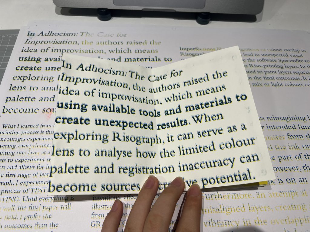
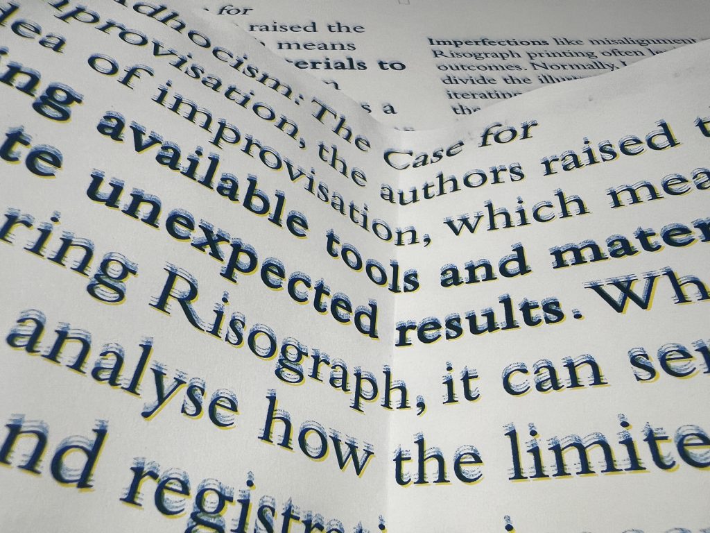
In Adhocism: The Case for Improvisation (Jencks and Silver, 2013), the authors raised the idea of improvisation, which means using available tools and materials to create unexpected results. When exploring Risograph, it can serve as a lens to analyse how the limited colour palette and registration inaccuracy can become sources of creative potential.
The first challenge I faced when using Riso-printing as a medium is that the colour cannot be completely copied due to the limited colour palette. However, the layering process and the overlapping colours create intentional effects. For those illustrations that I chose to redo from the two artists, I used grain-touch mode when printing, which is a good effect for blending colours and making a smooth colour shift.
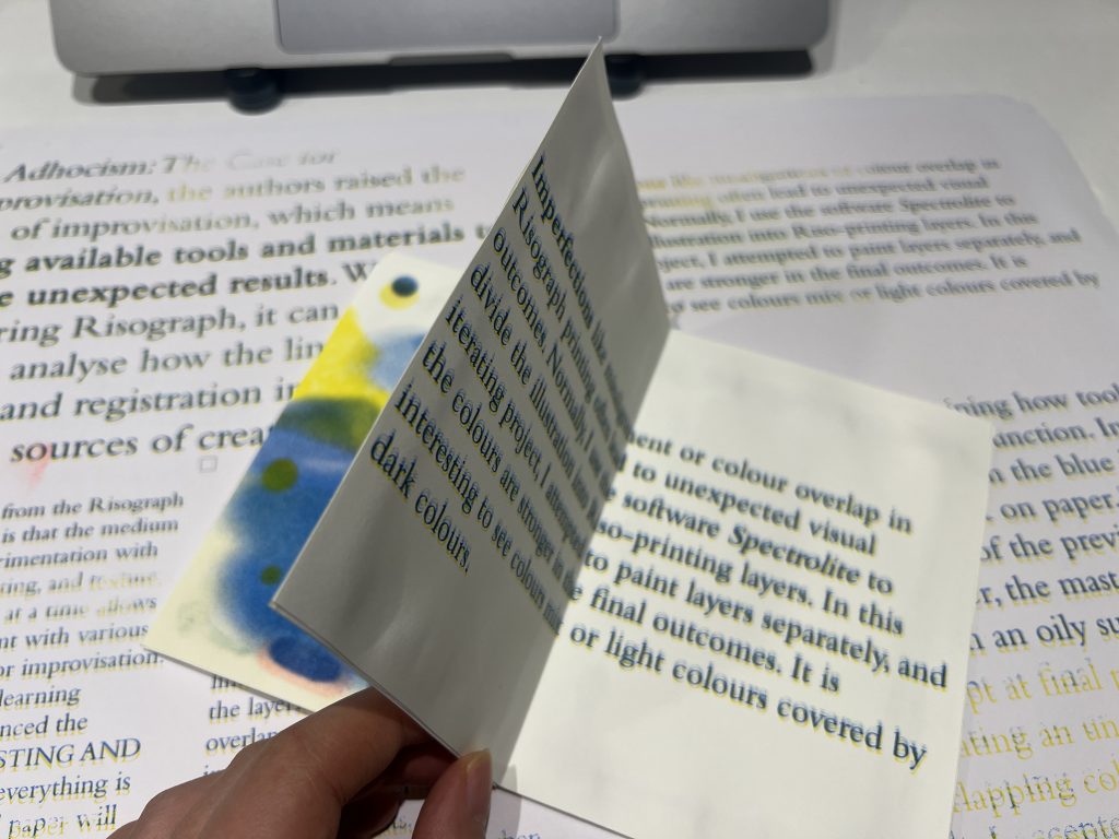
Imperfections like misalignment or colour overlap in Risograph printing often lead to unexpected visual outcomes. Normally, I use the software Spectrolite to divide the illustration into Riso-printing layers. In this iterating project, I attempted to paint layers separately, and the colours are stronger in the final outcomes. It is interesting to see colours mix or light colours covered by dark colours.
Risograph printing is not for perfect work. There are always situations happening during the printing process. Fine details can get lost or muddy. For Inès Gradot’s artwork I used thick papers, Redeem 240 gsm, the friction causes the paper rubbing when going through the ink roll, which may lead to the displacement of the output. Even though I print 10 copies repeatedly, each of them is unique. When it comes to Munken Pure Rough 120 gsm, the performance of the printer is easier and better.
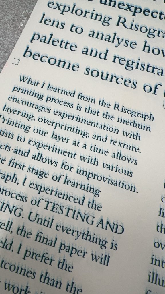
What I learned from the Risograph printing process is that the medium encourages experimentation with layering, overprinting, and texture. Printing one layer at a time allows artists to experiment with various effects and allows for improvisation. At the first stage of learning Risograph, I experienced the whole process of testing and adjusting. Until everything is working well, the final paper will be on the field. I prefer the Risograph outcomes than the digital painting work since I see the blending of inks.
Adhocism (Jencks and Silver, 2013) encourages reimagining how tools can be used beyond their intended function. In one instance, I picked a master from the blue ink drum, and transferred the ink on paper. The outcomes show some part of the previous printing patterns. However, the masters are hard to dry since the ink is on an oily surface. Furthermore, an attempt at final print resulted in misaligned layers, creating an unexpected vibrancy in the overlapping colours. Rather than discarding the result, I accepted the outcome as a conscious aesthetic decision.
Bibliography
Jencks, C. and Silver, N. (2013) Adhocism: The Case for Improvisation. Cambridge: The MIT Press.
Draft 3